I'm a sucker for magazines, I always look forward to traveling because I allow myself decadent magazine purchases with the premise that it makes up for a long flight and what's sure to be compromised personal space. After a trip a couple weekends ago to visit family on the East coast I noticed I have a pattern down: one design mag, one entrepreneur/business mag and one gossip mag - I guess it addresses all interests of mine, some good, some not so pretty…. I know I'm not alone, don"t judge! Luckily there's no shortage of outstanding online magazines to peruse whenever the fancy strikes and for you I've highlighted my top seven.
This Toronto magazine is at the top for a reason, this is one of my new favorites that I stumbled upon just recently. Although its mission is to take a peak into interesting (Canadian?) people and their homes with no help from stylists or interior designers, I'm a bit skeptical about this. The photos are stellar, the spaces typically full of eye candy so not that much different than your typical home living mag. What I like most about it is the focused point of view, each issue only highlights one home and one homeowner (or homeowners) allowing for a ton of photos to round out the narrative. Then its followed up by a question/answer section focused on the homeowner or homeowners, with smart links to their favorite music, books & any various inspiration. The rest of the content revolves around themes based off the main story, like the pages above which highlights items inspired by the homeowners love of art drawings. The issue typically ends with a cocktail recipe, perhaps you start there and mix yourself up something to drink while you read… just a thought!
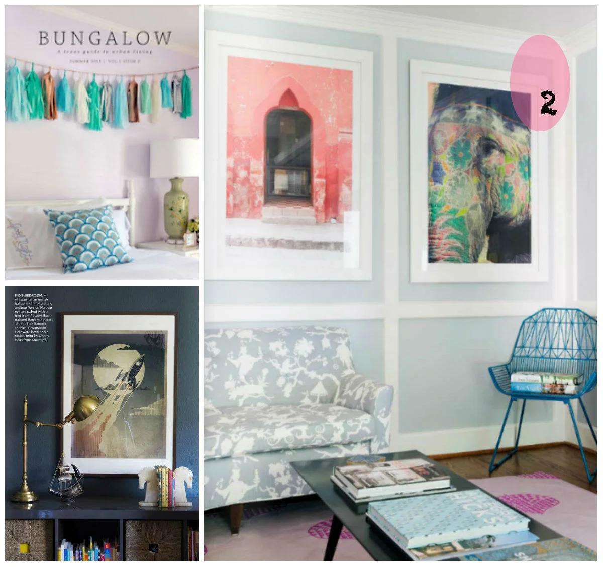
When I think of a magazine titled Bungalow all I see is the quintessential Midwestern Arts and Crafts homes I fell in love with while living in Minnesota. Evidently Bungalow has a different meaning in Texas, because this year old publication is all about vibrant urban living - featuring a mix of homes from vintage to modern with all kinds of southern charm in between. What I love about the spaces in this magazine is the mix of traditional, eclectic, arty and vintage that I would've never had guessed I would find in a Texas design magazine! This current issue is full of color, from patterns to wall accents - it's the perfect summer design resource.
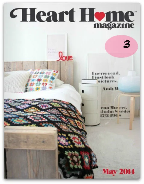
Images from Heart Home online magazine
British interior design magazine Heart Home shows up quarterly and is uniquely focused on English design, mixed in with lovely garden tours and travel expeditions. Its full of ideas and trends, showcased in artists' spaces or in people's homes. The smart links make it easy to source recommendations and the images always seem genuine and not overly styled. The magazine's web site offers a gallery page of images that are available for download if properly credited, which is fantastically useful when creating image boards or inspiration folders.
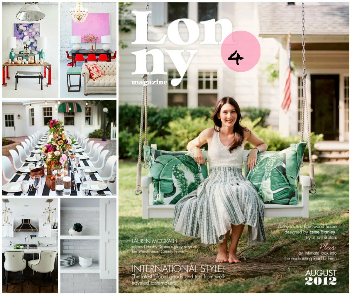
This magazine is massive, I imagine a paper copy equaling the heft of a phone book. Ok, maybe a small coastal town phone book, but Lonny is loaded with content far less dry than that by-gone gem. The magazine is unique in that you read it going down, like a really long scroll that you started from the top and let it fall at your feet. The experience of reading the magazine is half the appeal, images are smartly linked to their online shopping sources and albums of beautifully photographed images wait nestled within the articles just waiting to be freed and viewed. The variety of stories covered by Lonny make it a popular read, as there is almost certainly a story or an image that will grab your imagination and make you stay awhile. Many of the articles will end with a summary or breakdown of the tools of the designer, or the process of the artist, or the history of the place - I think this empowers the reader to understand the process of design rather than just appreciating the final product with no additional context.
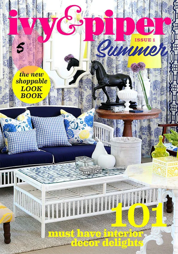
So…. Ivy & Piper is a stretch to be considered a magazine, it's really on online catalogue for a design firm based in Australia, but it's so fun to look at! Full of tips and style know-how, the pages are loud with color and texture.
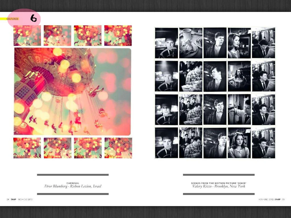
I'm a sucker for Hipstamatic, and although only one out of ten of the photos I take with that app look remotely cool, apparently there are a lot of people around the world finding success. SNAP magazine is an online magazine powered by Hipstamatic and its fans. Theres a little bit of everything: style, travel, music, art, food - all highlighted with moody filtered photos.
Matchbook is a fabulous read, starting with looks and items inspired by a theme like summer along Lake Michigan, or Rio de Janeiro. Curating the colors, textures and pieces that evoke an exotic trip opens the doors for a zillion interesting gems. The issue is jam packed with styled photo sessions and linked resources. The interviews with designers, makers and creatives are generously given many pages of images to showcase their work, process and advice. The magazine's web site and blog offer great lists from what liquor to stock on your bar cart to the 50 best novels, all starring strong female heroines, of course.

