Recently I've been tasked with a retail project that although has one main storefront entrance, there are two separate offerings inside. It's not unusual, the most common example may be a restaurant and a bar, although the spaces are related you may have to make a decision to turn right for the bar and left for the restaurant. In that situation the bar is typically dealt with in a distinct manner than the rest of the space. The lighting is moodier, the seating is more intimate, etc. In this case, a decision is made in the early stages of the design of what the experience wants to be. Does the primary space envelop the secondary space, do they share the attention, or do you go through one space to enjoy the next? All of these questions inform what becomes the parti diagram, or the "big idea", of the project. In my particular floorpan, the secondary space has an entrance through the primary space, so the challenge is how to identify that entry. In this post I thought I would share 5 primary ways I've found to successfully distinguish a subsidiary space. Although each one of these efforts may be powerful in their own right, the challenge of a designer is to match the expectation of the experience with the multidimensional of the space. The final product is made of many layers of dialogue, some being more or less obvious than others. So if the expectation is that the two offerings within the storefront are to be in contrast with one another, there is still an underlying language between the two that binds them covertly, slyly.
1 :: two dimensions
Starting with the simplest strategy, creating a focus of color within the larger space. This could mean a neutral tone throughout with an accent at the secondary entry or that each of the programs has their own distinct color. In the example above different hues of the same color create zones within the space, but the uniformity of the chairs tie in the larger scope. A colorful mural or a statement of mission are other ways that one wall or zone can be distinguished from the whole.
2 :: three dimensions
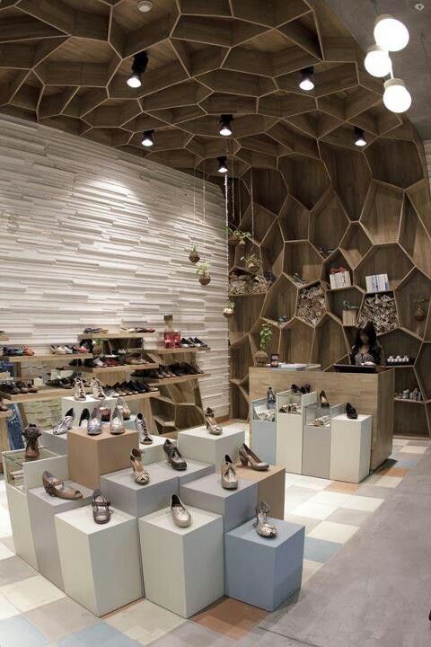
The second way to define the entry is to add an element of sculpture. Companies like Modulararts and Interlam provide decorative wall tiles, panels and blocks that can be used to good effect. These can come pre-finished or ready to paint out with the rest of the wall. An organic way to add texture and varied color to a space is by including a vertical living wall. This also has the benefit of providing healthier indoor air! Merging sculpture with product shelving is another successful way to gain people's attention and economize on the retail floor space.
3 :: manipulate the volume
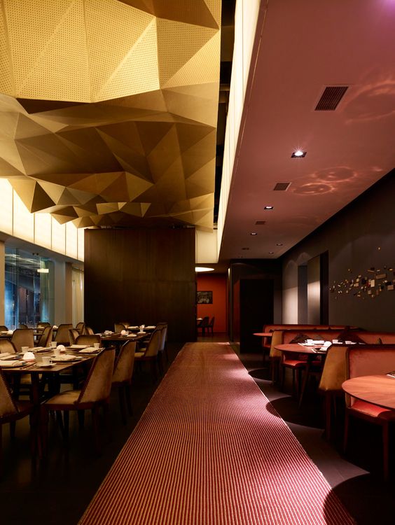
In the retail project I'm currently working on there is a fantastic double height space at the entry, but unfortunately, the storage mezzanine is also clearly visible from the entry. In this case it made sense to create a suspended screen that blocked views of the upper storage and defined the program beneath it. People experience changes of volume throughout the space wether its around them or above them or both. If the goal is to drive the experience then manipulating the volume is key. Take the image below, I love how unexpected that gilded faceted form appears within a sea of straight & narrow!
4 :: screen for effect
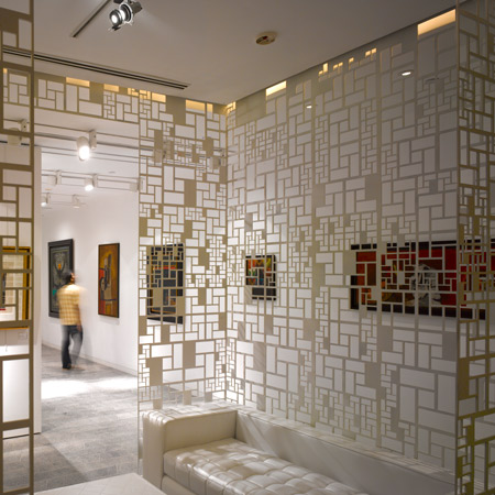
A theoretical approach to entries is what is sometimes known as the "denial and reward" strategy. Showing only a small portion of what's to come entices someone to want to see more. Adding a screen can also allow for a more directed and controlled sequence with added elegance. Being covert about the entry may also imply a privilege or secrecy elevating the perceived value of the product. I think the example below also helps convey the feeling of anticipation that a screened narrow walk provides.
5 :: installation
The last suggestion is almost counter to the other four, in that the larger space is not necessarily modified but is host to what seems a temporary installation. Similar to a pop-up shop, an installation allows one to play with trends and bold moves without risk of commitment. A small area can be changed out and updated easier than the whole, and it's probably a lot less expensive!
Images courtesy of : archdaily, google, design milk, archdaily, pinterest, platform arquitectura, afflante, design chronicle, wallpaper, retail design blog, estliving, aortic, inhabit living, yellow trace, behance, contemporist, dezeen, designboom, interior design


