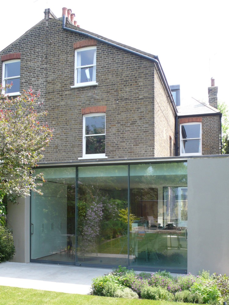
 Ipcock Residence - el dorado incThis segment is more a firm spotlight than one unique home or space. El dorado is a firm out of Kansas City that manages to blend architecture, fabrication, sculpture and design build projects all under one roof. I initially heard about them in 2004 when their Ipcock Residence received a lot of praise in the press. This residence, as well as many of their others, drew me in because of its elegant material palette and the way that the panes of glass were detailed to create the illusion of a floating ceiling plane.
 Westside Residence - el dorado incThe precise way each of the varying interior and exterior finishes was articulated belied the firm's background in fabrication and I envied their knowledge of connections. Designer's are nothing if not for their detailing, how you take something simple and plain and make it inspiring and beautiful - I definitely aspire to this ideal and I think el dorado has moments of this in every project they undertake.
 1737 Main - el dorado inc
 Pizzabella South - el dorado inc
Through the years they've grown and their work has spread into all aspects of commercial and civic, but they bring that precision and tight material palette to those spaces as well. Creative firms housed in many of the Kansas City downtown buildings call on el dorado to update their space but trust that they will maintain the historic character and charm. Some examples show the firm successfully doing this by employing colorful wall planes, custom fabricating lighting fixtures and entry canopies and integrating branding and shade structures to add layers to the building.
 Woodruff Sweitzer Office - el dorado inc
I know there are many more great spaces to show you from this firm, plus there's a whole story on regional design that I'm sure I haven't touched on but definitely adds to their appeal and unique approach. Long story short I like this firm and look forward to their stuff because their story resonates with me, their materials and details have evolved not changed and their initial work is still glimpsed in their current projects over 15 years later. What firms inspire you and make you seek out their latest projects for your own inspiration?


