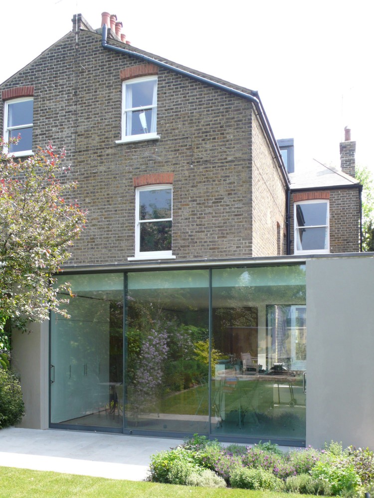
Kicking off my research into the details found when piecing together new into old, I share with you the work of McLaren.Excell. A British firm focusing on both architecture & interior residences, McLaren.Excell creates beautifully crafted spaces endowed with light, clarity of material & a contemporary aesthetic often within old stone buildings or terraced London flats. Their process often involves pairing the home down to it's basics, removing old layers and celebrating the inherent structural materials of brick, stone, timber & rubble. The new additions are carefully entertwined or simply overlayed, each allowed to speak to its use & innate beauty. I love their use of cool sleek grey concrete countertops next to ancient elm timbers or rusted Corten steel which melds perfectly with old orange-y red brick.
Family room conversion :: whiskey & a blue Chesterfield
Progress on the basement playroom to family room conversion continues along, albeit slowly. The drafty french doors to the patio have been replaced with a set of weather tight walnut clad doors. The old decommissioned wood fire box has been removed and in it's place a gas insert sits. The heavy popcorn texture has been removed from the ceiling (no asbestos, yay!) and recessed can lights now illuminate the room. The walls are now painted with a Sherwin Williams Peppercorn, a warm dark grey - a bold move I'm glad I made!
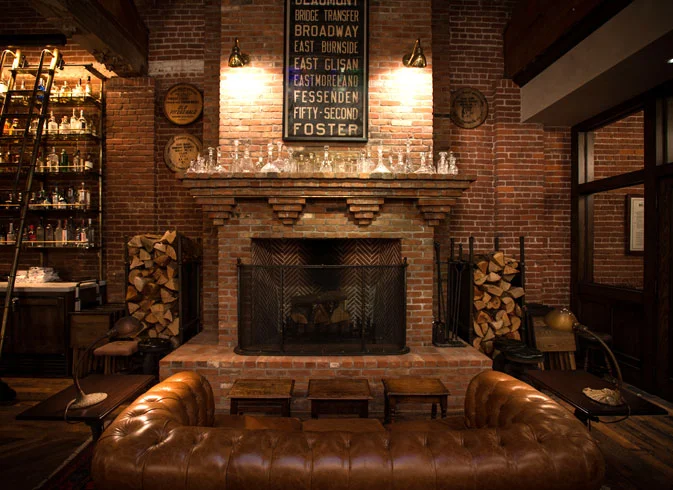
At the outset of this project my husband had his heart set on having a Chesterfield sofa in this room and channeling a vibe akin to the Multnomah Whiskey Library - a space with ample waxed mustaches, walls of whiskey, overstuffed chairs and a dark moody atmosphere. This doesn't really mesh well with my mid-century aesthetic, so thankfully we compromised on a beautiful blue Chesterfield sofa which seemed way more playful than the traditional type. He found this family-run company in North Carolina that makes amazing couches and it's less expensive than the ones he was eyeing on sale at Restoration Hardware! You can pick your length, leather, style, legs - sold! The only catch is being patient while they make it and send it along, but 3 months is worth the wait. It should be here by mid-May!
The back of the room has an inset that eventually will be converted to storage casework for the tv electronics, board games, books, etc.. I found some beautiful modular storage pieces from west elm with walnut and brass accents, but it all priced out over $3,000 which is more than that sofa costs! I'm getting a quote for custom cabinets and then we'll see where we land. Initially in laying out the cabinet design I was trying to channel what the house wanted, i.e. what would look original to the house. The only built-ins we have are in the kitchen and it's just a small triangular corner with a tiny lower cabinet and triangular open shelves above, all gloss white with 2" beveled trim, very 50's. But the idea of melding something new with the old, a detail or a series of details that would fit the age of the house but also introduce something new to the mix, has always intrigued me. Mostly because it can be done so well or so horribly, and in both instances you stop and investigate. Either relishing the mix or staring at a train wreck. So, I've decided to showcase some of these old + new examples in the next few posts that I've come across in my research and let you judge their success.
It's been sooooo long - I've missed this! Not that I haven't had anything to share in two months, but it's been a hard two months. I typically don't divulge much about my back story, I'm a pretty private person in general, don't worry you won't hear me sharing my birth story. But that being said, I realize the people I tend to connect with the most online are ones that do share personal challenges and (seem) fairly genuine. Although my intent at the beginning of this blog was to curate things I find interesting and inspiring, it sometimes rings untrue to my daily work and it makes it difficult to create a community of support.
The last couple of months I've spent studying for the structural portion of the architectural registration exams (ARE). I am not a math person and even though I found learning about structures interesting, it was more than I had ever wanted to know. But evidently not enough of the content stuck with me because I didn't pass the exam and have to retake it. This is part of 7 other tests that are required for architectural licensure and I have a ways to go to finish. If I have a chunk of time and I'm not studying for these tests, I feel incredibly guilty, especially because I've had to put off family time to focus on them. That would explain why I haven't prioritized my blog, although it gives me great satisfaction and pleasure to write these posts.
Another thing that has rumbled inside of me for awhile is my intent for this blog, I don't do a lot in my daily tasks that is worth elaborating on. That's why I started searching for inspiration in the first place, to create a little port hole into what I appreciated in design. Five years into this, I've read many many articles on how to write a good post, on what do your followers want to hear, on how to take it to the next step. It's not rocket science, I get it, the gist is to educate and inform your readers. Something that's hard to do when you are sharing pieces of the internet that aren't of your own doing. But until I have my own awesome projects to share, I intend to keep being inspired daily by all that is around me. I guess in the end we all end up with a different story based on the same stuff everyone else is seeing, so I appreciate you sticking by me and seeing what the next find will be...
Oh, and in the interest of being authentic (I know that term is overused, just like artisan or maker, oh well) - I'm a complete sucker for inspirational quotes, best when paired with good fonts. So although I was on the search for something along the lines of "suck it up and move it along" (I obviously should stay away from writing inspirational quotes), I thought the above quote was hilarious and it's exactly what's happening, right?!
Image credit : wordsonimages
Martha's magic :: American Made
It's no surprise that Martha Stewart, with the help of her hugely successful conglomerate of everything Martha Stewart Living, is one of the biggest advocates of promoting the national maker culture and the entrepreneurial spirit in which it thrives. This year marks the third year of her American Made program which celebrates small businesses with cash awards and media publicity. The awards are organized under four different categories: Crafts, Design, Food and Style - with each of the winners' wares being sold on the American Made Market on eBay.
The American Made web site is a trove of inspiration as hundreds of creatives show their products and tell their stories. Not only are the winners profiled, but so are all the finalists who entered the contest. Trolling through this curated list of makers introduces you to hundreds of small businesses across the country, doing things from distilling small batch whiskeys to fabricating one of a kind light fixtures. Sometimes it cracks me up that there's a market for some stuff, but props to them for finding the right crowd - right!? I'm looking at you, needle-felt miniature animal artist ...
Image credit : Martha Stewart American Made
old house love
I'm a big fan of old houses, ever since I was a kid I've always wanted to live in a house with history and, for the most part, it's always worked out that way. As a proponent of sustainability, working with what is existing is always where I begin and then hope to extend the lifeline that much more. With that in mind, I thought I would share 3 very different posts this week that I happened to run accross , each of which celebrates the potential of an old house...
The first was a post about the newest Mission Zero certified project under the Living Building Challenge. A 1910 house in Ann Arbor, Michigan which not only achieved net zero energy (produce as much energy as you use), but was a historic rehab project as well. The fact that a project could successfully manage to collaborate and meet all the requirements within two very stringent standards is a very hopeful sign, one that signals a progressive dialogue between a sustainable future and a preserved past. Check out the progress and the details of this project, including lessons learned along the way, at their site.
The second post I came across was while reading the Sunset Magazine blog, Westphoria. Apparently, the 2015 Sunset Idea House is a renovation of a 1954 Mid-Century Modern home in Denver. My interest is piqued because not only do I love this era of houses, but I live in a 1950's Mid-Century Modern home in Portland and I am curious to see the before and afters. The article noted the plans for the house include moving the kitchen from the front of the house to the back (I wish I had the $ to do that, it's my biggest pet peeve!!), adding a second story master bedroom and roof deck and updating the basement with a playroom and home theatre. It's been interesting to read the post comments, all basically negative towards the intentions of the design, which as in all Sunset Idea Homes will likely be over the top. The main concern is the "pop top", I guess that's been a popular though derisive thing in Denver to add a second story on a ranch which unfortunately impinges on the neighbor's views/space/privacy. It's no secret that American's love of ample square footage has increased since the 1950's, but the goal here is to create longevity along side what people consider a "need" for space. My hope is that the design is a clever solution that retains the charm of the original even if the scale is altered, and doesn't infringe on the neighbors' space - worth following to the grand finale later this year.
The third article of interest is the announcement that 10 Frank Lloyd Wright houses are being nominated as a singular World Heritage Site to the United Nations prestigious list of significant cultural sites. The inclusion of these works, which include homes as well as civic buildings, would be the first representation of modern American architecture on the roster which includes sites such as the Acropolis in Athens and Notre Dame Cathedral in Paris. Some of my personal favorites on the list include Fallingwater, The Robie House and Taliesin West. There's no doubt those long linear stacked planes, the dramatic balance of shadow and daylight and embracing the beauty of natural material still influence today's designers. Including these as international landmarks can only help in the cause of preserving their legacy, which is ideally what will be decided as the nominations are reviewed by the United Nations committee over the course of the year.